Chapter 1 Introduction
1.1 Resources
Bayesian Data Analysis by Andrew Gelman, et. al.
Statistical Rethinking by Richard McElreath
A First Course in Bayesian Statistical Methods by Peter Hoff
1.2 A Motivating Example
Let’s start with something familiar–the Monty Hall problem. There are three doors labeled A, B and C. A car is behind one of the doors and a goat is behind each of the other two doors. You choose a door (let’s say A). Monty Hall, who knows where the car actually is, opens one of the other doors (let’s say B) revealing a goat. Do you stay with door A or do you switch to door C?
We can frame the problem as follows:
Initially, you believe the car is equally likely to behind each door (i.e., \(P[A=car]=P[B=car]=P[C=car]=\frac{1}{3}\)). Let’s call this the prior information.
Next, you can calculate the conditional probabilities that Monty Hall opened door B. Let’s call this the likelihood.
\[\begin{align*} P[B=open | A=car] &= \frac{1}{2}\\ P[B=open | B=car] &= 0 \\ P[B=open | C=car] &=1 \end{align*}\]
- Finally, you can update your beliefs with the new information. Let’s call your updated beliefs the posterior.
\[\begin{align*} P[A=car|B=open] &= \frac{P[B=open|A=car]P[A=car]}{P[B=open]} = \frac{1/2 * 1/3}{1/6 + 0 + 1/3} = \frac{1}{3} \\ P[B=car|B=open] &= \frac{P[B=open|B=car]P[B=car]}{P[B=open]} = \frac{0 * 1/3}{1/6 + 0 + 1/3} = 0 \\ P[C=car|B=open] &= \frac{P[B=open|C=car]P[C=car]}{P[B=open]} = \frac{1 * 1/3}{1/6 + 0 + 1/3} = \frac{2}{3} \end{align*}\]
Clearly, you should switch to door C.
This is a toy illustration of how to think about a model in a Bayesian framework:
\[posterior \propto likelihood * prior\] (See the resources for a proper mathematical derivation.)
1.3 Workflow
The workflow I’ll follow in the subsequent chapters is as follows:
- Define the model.
- Examine the prior predictive distribution.
- Examine diagnostic plots.
- Examine posterior distribution.
- Examine the posterior predictive distribution.
In general, this is an iterative process. At each step you may discover something that causes you to start over at step 1 with a new, refined model.
1.4 Data
For all of the examples, I use the mtcars data set and a model with mean centered disp as the predictor and mpg as the response. I start with a simple linear regression. However, as you can see from the scatterplot below, the relationship between mpg and disp is not linear, so I also fit a slightly more complex semi-parametric model.
There are two reasons why I use mean centered disp:
Interpretation of the intercept is the average mpg at the average value of displacement versus average mpg at zero displacement (which has little practical meaning).
Several of the packages used in the examples assume priors are for mean-centered predictors for sampling efficiency.
I use the bayesplot package to demonstrate the steps for creating some of the most common diagnostic plots. I found this helpful as I was learning how to use each package. The tidybayes package is another good option for visualization of Bayesian models. However, I highly recommend the shinystan package; it will automatically create all of these diagnostic plots (and more) with an nice interactive web interface.
library(tidyverse)
library(datasets)
data(mtcars)
mtcars %>%
  ggplot(aes(x=disp, y=mpg)) +
geom_point() 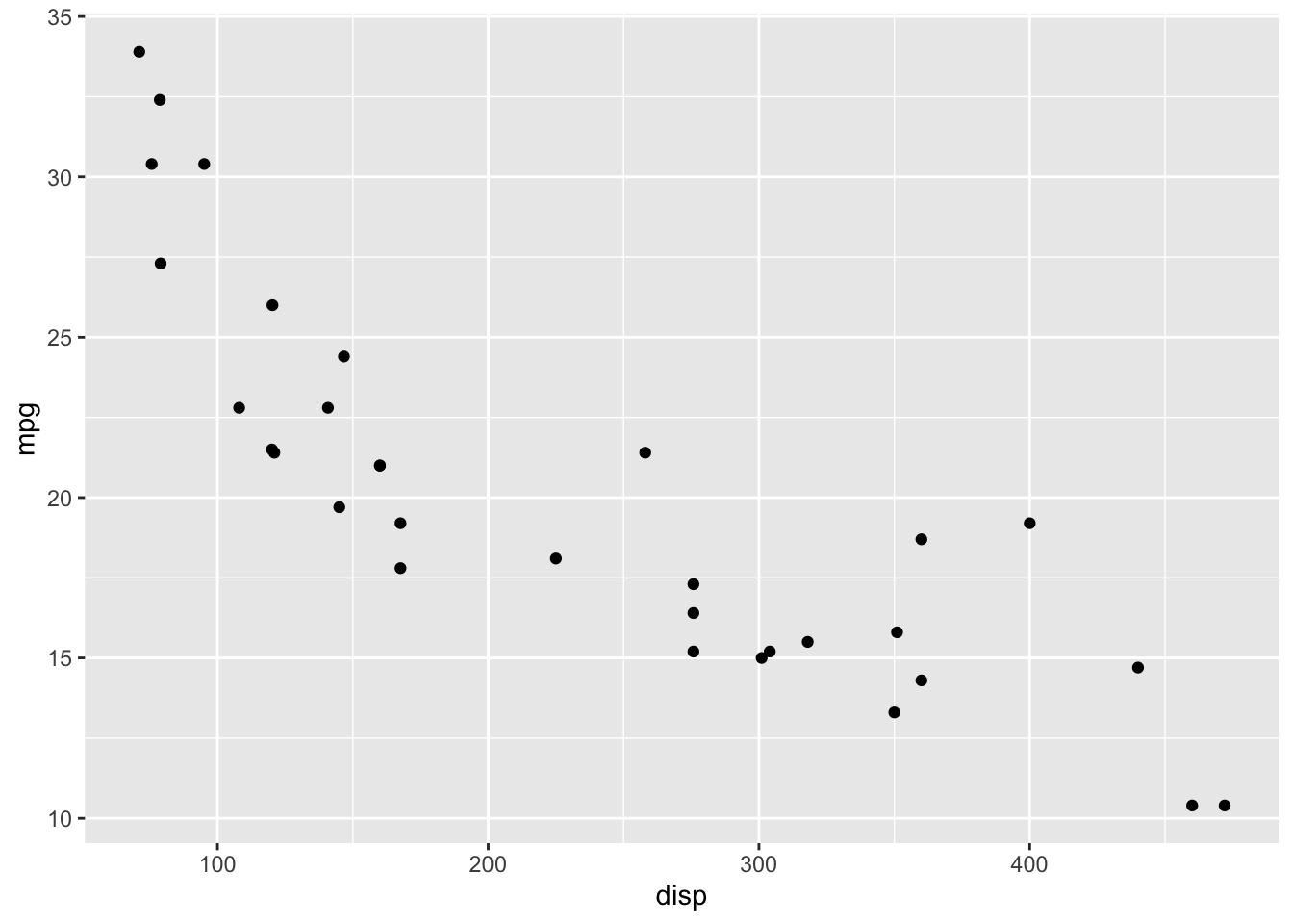
1.5 Prior Information
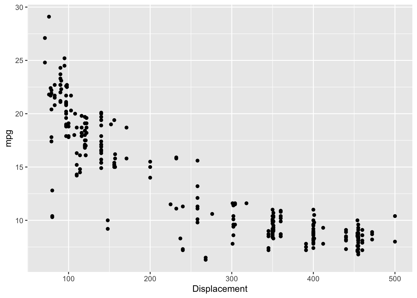
The mtcars dataset was extracted for Motor Trend magazine data on 1973-1974 models. The 1974 EPA Car Mileage Guide lists the mpg and engine size (i.e displacement) for U.S. cars and light duty trucks. The data is plotted below.
library(gridExtra)
library(here)

epa <- read.csv(here("data", "EPA_1974.csv"), header=TRUE)

p1 <- ggplot() +
  geom_histogram(data=epa, mapping=aes(x=mpg), binwidth = 1)

p2 <- ggplot(epa) +
  geom_histogram(mapping=aes(x=Displacement), binwidth=20)

p3 <- ggplot(epa) +
  geom_point(mapping=aes(x=Displacement, y=mpg))

grid.arrange(p1, p2, ncol=2)
p3