
Bayes Part 2
Introduction
In this post, I’ll work through the same example as in Part 1 but this time using the rethinking package. Recall that I’m using the mtcars dataset, and I’m interested in a model with response mpg and predictor disp.
Setup Environment
First some basic R environment setup.
rm(list=ls())

library(tidyverse)
library(rethinking)
library(bayesplot)
library(shinystan)
library(rstan)
library(gridExtra)

knitr::opts_chunk$set(out.width = "50%")
knitr::opts_chunk$set(fig.align = "center")
knitr::opts_chunk$set(message=FALSE)
knitr::opts_chunk$set(warning=FALSE)

options("scipen" = 1, "digits" = 4)

set.seed(123)
library(datasets)
data(mtcars)
head(mtcars)
##                    mpg cyl disp  hp drat    wt  qsec vs am gear carb
## Mazda RX4         21.0   6  160 110 3.90 2.620 16.46  0  1    4    4
## Mazda RX4 Wag     21.0   6  160 110 3.90 2.875 17.02  0  1    4    4
## Datsun 710        22.8   4  108  93 3.85 2.320 18.61  1  1    4    1
## Hornet 4 Drive    21.4   6  258 110 3.08 3.215 19.44  1  0    3    1
## Hornet Sportabout 18.7   8  360 175 3.15 3.440 17.02  0  0    3    2
## Valiant           18.1   6  225 105 2.76 3.460 20.22  1  0    3    1
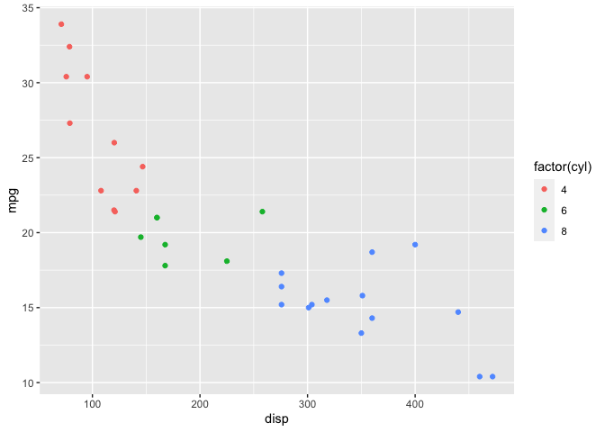
mtcars %>%
  ggplot(aes(x=disp, y=mpg)) +
  geom_point(aes(color=factor(cyl)))
Before I start fitting models, I’ll calculate the mean and standard deviation of both mpg and disp since I’ll need this information later.
mu <- mtcars %>% select(mpg, disp) %>% colMeans()
sigma <- mtcars %>% select(mpg, disp) %>% apply(2,sd)

knitr::kable(cbind(mu, sigma), col.names = c("Mean", "Std Dev"))
| Mean | Std Dev | |
|---|---|---|
| mpg | 20.09 | 6.027 |
| disp | 230.72 | 123.939 |
Linear Model
Again I’ll start with a linear model even though it clearly isn’t going to be a great fit to the data. The rethinking package doesn’t have default priors, so I need to explcitly choose them:
# Define model
# Note the sign change for mu and b, this seems to be a quirk
# of map2stan that it didn't like b ~ dunif(-0.1, 0)
f <- alist(
  mpg ~ dnorm(mu, sigma),
  mu <- a - b * (disp - 230.7),
  a ~ dnorm(25, 10),
  b ~ dunif(0, 0.1),
  sigma ~ dexp(0.2)
)
# Fit model
# Note the default number of chains = 1, so I'm explicitly setting to 4 here
mdl1 <- map2stan(f,mtcars, chains=4)
Prior Predictive Distribution
Next, I’ll examine the prior predictive distribution to see if the default priors seem reasonable.
# Plot prior predictive distribution
N <- 100

prior_samples <- as.data.frame(extract.prior(mdl1, n=N))

D <- seq(min(mtcars$disp), max(mtcars$disp), length.out = N)

res <- as.data.frame(apply(prior_samples, 1, function(x) x[1] - x[2] * (D))) %>%
  mutate(disp = D) %>%
  pivot_longer(cols=c(-"disp"), names_to="iter")

res %>%
  ggplot() +
  geom_line(aes(x=disp, y=value, group=iter), alpha=0.2) +
  labs(x="disp", y="prior predictive mpg")
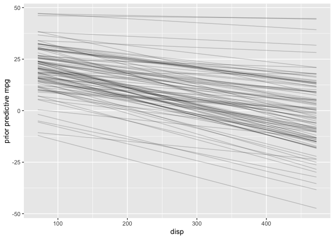
The priors look reasonable since I know in the real world mpg must be positive and can’t increase as disp increases.
Diagnostic Plots
Trace Plots
The traceplot function (equivalent to mcmc_trac in the bayesplot package) plots the MCMC draws.
traceplot(mdl1@stanfit)
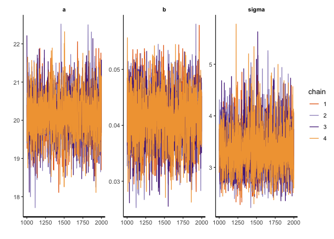
Recall that there are three things I am looking for in the trace plot of each chain:
-
Good mixing - In other words, the chain is rapidly changing values across the full region versus getting “stuck” near a particular value and slowly changing.
-
Stationarity - The mean of the chain is relatively stable.
-
Convergence - All of the chains spend most of the time around the same high-probability value.
The trace plots above look good.
Trace Rank Plot
Another alternative is the trankplot function (equivalent to the mcmc_rank_overlay function in the bayesplot package).
trankplot(mdl1)
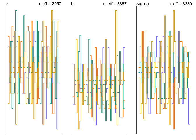
Effective Sample Size
The trankplot function conveniently also displays the effective sample size (n_eff). But the precis function is another way to get that information.
precis(mdl1)
##          mean       sd    5.5%    94.5% n_eff  Rhat4
## a     20.1235 0.598022 19.1735 21.05771  2957 1.0006
## b      0.0412 0.004769  0.0334  0.04873  3367 0.9997
## sigma  3.3466 0.451233  2.7081  4.12952  3289 1.0001
Posterior Distribution
Since the chains and n_eff look good, I’ll examine the posterior distribution next. Again, the precis function gives both the point estimates and credible intervals for a, b and sigma.
precis(mdl1)
##          mean       sd    5.5%    94.5% n_eff  Rhat4
## a     20.1235 0.598022 19.1735 21.05771  2957 1.0006
## b      0.0412 0.004769  0.0334  0.04873  3367 0.9997
## sigma  3.3466 0.451233  2.7081  4.12952  3289 1.0001
Posterior Predictive Distribution
Finally, I’ll check the posterior predictive distribution. The postcheck function displays a plot for posterior predictive checking.
postcheck(mdl1, window=nrow(mtcars))
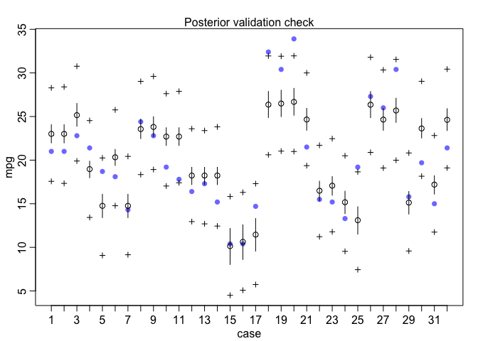
Under the hood, the postcheck function uses the sim function which draws samples from the posterior predictive distribution. So I can also use the sim function directly to create the same posterior predictive distribution plot as I did with rstanarm previously.
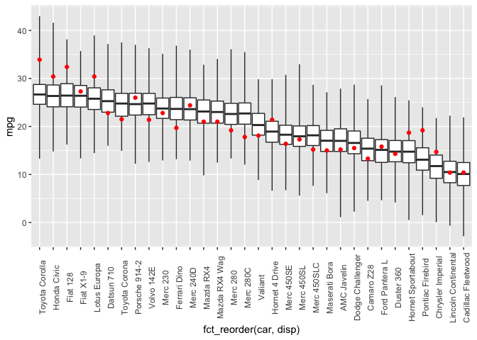
library(forcats)

post <- sim(mdl1) %>%
  apply(2, fivenum) %>%
  t() %>%
  as.data.frame()
dat <- mtcars %>%
  select(c("mpg", "disp")) %>%
  rownames_to_column(var="car")

cbind(dat, post) %>%
  ggplot(aes(x=fct_reorder(car, disp))) +
  geom_boxplot(mapping=aes(ymin=V1, lower=V2, middle=V3, upper=V4, ymax=V5),
               stat="identity",
               outlier.shape = NA) +
  geom_point(mapping=aes(y=mpg), color="red") +
  theme(axis.text.x = element_text(angle = 90))
Another useful visualization is the expectation of the posterior predictive distribution (i.e., (\mu)). The link function returns the linear predictor, possibly transformed by the inverse-link function. In this case, the model is a Gaussian likelihood with an identity link function, so the sim and link functions return identical results.
newdata <- data.frame(disp=seq(min(mtcars$disp), max(mtcars$disp)))

y_rep <- as.data.frame(t(link(mdl1, data=newdata, n=50))) %>%
  cbind(newdata) %>%
  pivot_longer(cols=starts_with("V"), names_to="grp", values_to="mpg")
y_rep %>%
  ggplot(aes(x=disp, y=mpg)) +
  geom_line(aes(group=grp), alpha=0.2) +
  geom_point(data = mtcars, aes(color=factor(cyl)))
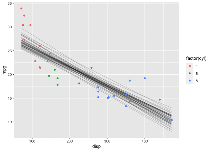
This looks very similar to the results as with the rstanarm package.
Generalized Additive Model
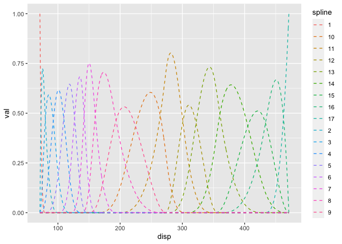
Setting up the semi-parametric model is a bit more work in the rethinking package. First, I create the splines explicitly. The component splines are plotted below.
library(splines)

num_knots <- 15
knot_list <- quantile(mtcars$disp, probs=seq(0,1,length.out = num_knots))
B <- bs(mtcars$disp, knots=knot_list[-c(1,num_knots)], intercept=TRUE)

# Plot at smaller intervals so curves are smooth
B_plot <- bs(seq(min(mtcars$disp), max(mtcars$disp)),
             knots=knot_list[-c(1,num_knots)], intercept=TRUE)
cbind(disp=seq(min(mtcars$disp), max(mtcars$disp)), B_plot) %>%
  as.data.frame() %>%
  pivot_longer(-disp, names_to="spline", values_to="val") %>%
  ggplot() +
  geom_line(mapping=aes(x=disp, y=val, color=spline), linetype="dashed")
Then I define the model with the splines. I wasn’t able to get this model to work with either the map2stan or ulam functions, so I used quap instead which is a quadratic approximation.
f <- alist(
  mpg ~ dnorm(mu, sigma),
  mu <- a - B %*% w,
  a ~ dnorm(25, 10),
  w ~ dnorm(0,5),
  sigma ~ dexp(0.2)
)


mdl2 <- quap(f, data=list(mpg=mtcars$mpg, B=B),
             start=list(w=rep(1, ncol(B)))
            )
Since MCMC was not used to fit the model, there are no chain diagnostics to examine. We can look at the posterior distributions, although they aren’t easy to interpret. The posterior predictive distribution will be more useful in evaluating the model.
precis(mdl2, depth=2)
##           mean     sd      5.5%  94.5%
## w[1]  -12.1848 1.8803 -15.18993 -9.180
## w[2]   -8.1348 2.3923 -11.95817 -4.312
## w[3]  -10.8610 3.4111 -16.31270 -5.409
## w[4]   -5.6670 2.7739 -10.10028 -1.234
## w[5]   -1.4722 2.1899  -4.97201  2.028
## w[6]   -1.1085 3.0008  -5.90438  3.687
## w[7]   -2.3218 2.3104  -6.01437  1.371
## w[8]    2.5826 2.1006  -0.77450  5.940
## w[9]    4.7527 3.7350  -1.21660 10.722
## w[10]  -2.6632 2.9667  -7.40458  2.078
## w[11]   6.0329 1.9256   2.95544  9.110
## w[12]   3.7257 2.3229   0.01326  7.438
## w[13]   7.4973 2.2851   3.84534 11.149
## w[14]   0.9143 2.8745  -3.67978  5.508
## w[15]   0.7548 3.5161  -4.86466  6.374
## w[16]   9.4496 2.5387   5.39222 13.507
## w[17]   9.7850 1.8494   6.82930 12.741
## a      20.6243 1.2476  18.63036 22.618
## sigma   1.5332 0.2117   1.19481  1.872
Posterior Predictive Distribution
And finally, the posterior predictive distribution:
mu <- link(mdl2)
mu_mean <- as.data.frame(apply(mu, 2, mean)) %>%
  mutate(disp=mtcars$disp)
colnames(mu_mean) <- c("mpg_ppd", "disp")

mu_PI <- as.data.frame(t(apply(mu,2,PI,0.89))) %>%
  mutate(disp=mtcars$disp)
colnames(mu_PI) <- c("lwr", "upr", "disp")

ggplot() +
  geom_point(data=mtcars, aes(x=disp, y=mpg, color=factor(cyl))) +
  geom_line(data=mu_mean, aes(x=disp, y=mpg_ppd)) +
  geom_ribbon(data=mu_PI, aes(x=disp, ymin=lwr, ymax=upr), alpha=0.2)
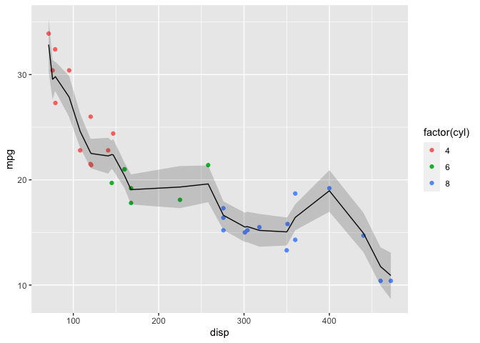
This plot is too “wiggly” so 15 knots (and thus number of basis functions) was excessive. For the rstanarm example I chose 7 basis functions which yielded a more reasonable fit.
Note that the plot isn’t smooth because the link function computes the inverse-link function at the specified values of disp when the model was fit. I’ll have to investigate the package further to determine how to extract predictions at interpolated values of disp.