Bayes Part 1
Introduction
The first course I took on Bayesian methods focused mostly on theory, and since the course was only one semester there wasn’t time to learn about some of the software packages that are commonly used for Bayesian analysis. This series of posts serves as an introduction to some of these R packages.
Since most of the people in my stats program were only familiar with R and SAS (and maybe a little Python), I think the following is an easy way to work up to rstan which has a more C-like syntax:
- rstanarm
-
Pro: Functions are syntactically very similar to frequentist functions with which users are already familiar.
-
Pro: Default priors are generally appropriate so the user isn’t required to specify priors.
-
Con: The user isn’t required to specify priors (i.e., caveat emptor).
-
- rethinking
-
Pro: Uses the R formula syntax with which users are already familiar.
-
Pro: The user is required to specify all priors (i.e., no shortcuts).
-
Pro: You can get the rstan model out of the rethinking model, so this is a nice bridge between R and stan syntax.
-
Con: None that I’ve found yet, other than it’s built on top of rstan so some folks might prefer to just go right to the source.
-
- rstan
-
Pro: It’s the R interface to stan which is the Bayesian MCMC software that runs on multiple platforms and supports multiple languages.
-
Con: If you aren’t familiar with C, Java or C++ then it’s a completely new syntax to learn on top of the Bayesian concepts
-
Approach
In general, a Bayesian model analysis includes the following steps:
- Fit the model
- Examine the prior predictive distribution
- Examine diagnostic plots
- Examine posterior distribution
- Examine the posterior predictive distribution
I will go through these steps in separate posts for each of the previously mentioned packages. I’ll start with rstanarm in this post.
Setup Environment
First some basic R environment setup
rm(list=ls())

library(tidyverse)
library(rstanarm)
library(bayesplot)
library(shinystan)
library(rstan)
library(gridExtra)
#library(tidybayes)

knitr::opts_chunk$set(out.width = "50%")
knitr::opts_chunk$set(fig.align = "center")
knitr::opts_chunk$set(message=FALSE)
knitr::opts_chunk$set(warning=FALSE)

options("scipen" = 1, "digits" = 4)

set.seed(123)
Define the Model
I’ll use the mtcars dataset.
library(datasets)
data(mtcars)
head(mtcars)
##                    mpg cyl disp  hp drat    wt  qsec vs am gear carb
## Mazda RX4         21.0   6  160 110 3.90 2.620 16.46  0  1    4    4
## Mazda RX4 Wag     21.0   6  160 110 3.90 2.875 17.02  0  1    4    4
## Datsun 710        22.8   4  108  93 3.85 2.320 18.61  1  1    4    1
## Hornet 4 Drive    21.4   6  258 110 3.08 3.215 19.44  1  0    3    1
## Hornet Sportabout 18.7   8  360 175 3.15 3.440 17.02  0  0    3    2
## Valiant           18.1   6  225 105 2.76 3.460 20.22  1  0    3    1
To keep things simple, I’m interested in a model with response mpg and predictor disp. Let’s plot the parameters of interest.
mtcars %>%
  ggplot(aes(x=disp, y=mpg)) +
  geom_point(aes(color=factor(cyl))) +
  stat_smooth(method="lm")
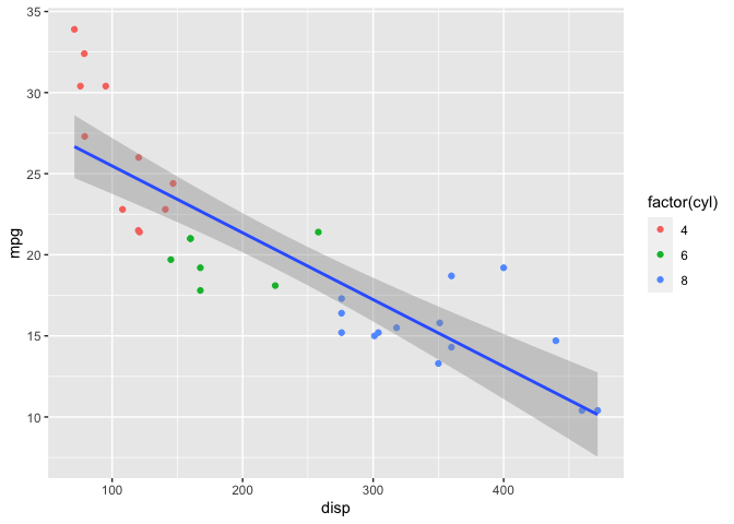
Clearly a linear model isn’t a great fit to the data; a spline would be more appropriate. I’ll demonstrate both models in this post.
Before I start fitting models, I’ll calculate the mean and standard deviation of both mpg and disp since I’ll need this information later.
mu <- mtcars %>% select(mpg, disp) %>% colMeans()
sigma <- mtcars %>% select(mpg, disp) %>% apply(2,sd)

knitr::kable(cbind(mu, sigma), col.names = c("Mean", "Std Dev"))
| Mean | Std Dev | |
|---|---|---|
| mpg | 20.09 | 6.027 |
| disp | 230.72 | 123.939 |
Linear Model with Default Priors
Even though it’s clear from the plot above that a linear model isn’t going to be a great fit to the data, let’s start with the following model to keep things simple:
mpg ~ Normal(\mu, \sigma^2)
\mu = a + b * disp
The stan_glm function from the rstanarm package fits a Bayesian linear model. The syntax is very similar to lm.
I’ll start by fitting a model with the default priors. When using the default priors, stan_glm automatically standardizes the parameters.
mdl1 <- stan_glm(mpg ~ disp, data = mtcars, cores=2)
Prior Predictive Distribution
Next, I’ll examine the prior predictive distribution to see if the default priors seem reasonable. The prior_summary function shows the default priors for the model as well as the adjusted priors after automatic scaling. See http://mc-stan.org/rstanarm/articles/priors.html if you are interested in the details about how the default and adjusted priors are calculated.
prior_summary(mdl1)
## Priors for model 'mdl1'
## ------
## Intercept (after predictors centered)
##   Specified prior:
##     ~ normal(location = 20, scale = 2.5)
##   Adjusted prior:
##     ~ normal(location = 20, scale = 15)
##
## Coefficients
##   Specified prior:
##     ~ normal(location = 0, scale = 2.5)
##   Adjusted prior:
##     ~ normal(location = 0, scale = 0.12)
##
## Auxiliary (sigma)
##   Specified prior:
##     ~ exponential(rate = 1)
##   Adjusted prior:
##     ~ exponential(rate = 0.17)
## ------
## See help('prior_summary.stanreg') for more details
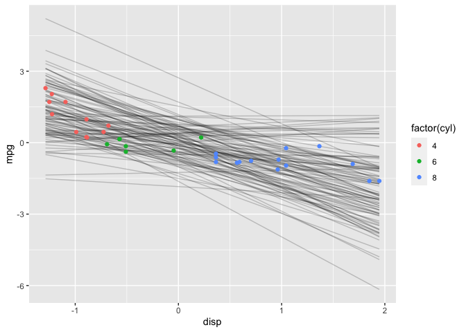
# Plot prior predictive distribution using adjusted priors
N <- 100

prior_samples <- data.frame(a = rnorm(N, 20, 15),
                            b = rnorm(N, 0, 0.12))

D <- seq(min(mtcars$disp), max(mtcars$disp), length.out = N)

res <- as.data.frame(apply(prior_samples, 1, function(x) x[1] + x[2] * (D-230.7))) %>%
  mutate(disp = D) %>%
  pivot_longer(cols=c(-"disp"), names_to="iter")

res %>%
  ggplot() +
  geom_line(aes(x=disp, y=value, group=iter), alpha=0.2) +
  labs(x="disp", y="prior predictive mpg")
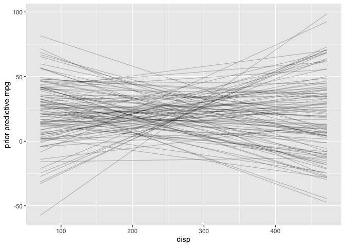
Two observations from this plot stand out: 1) negative mpg is unrealistic and 2) increasing mpg as displacement increases also seems unlikely in the real-world. Later on I’ll choose a more informative prior that incorporates this additional knowledge. However the adjusted default priors aren’t totally unreasonable so I’ll proceed with the analysis.
Diagnostic Plots
Once the model has been fit, either as.matrix or as.array extracts the posterior draws. The key difference is that as.array keeps the chains separate.
post <- as.array(mdl1)
str(post)
##  num [1:1000, 1:4, 1:3] 30.9 28.3 28.9 30.1 28.9 ...
##  - attr(*, "dimnames")=List of 3
##   ..$ iterations: NULL
##   ..$ chains    : chr [1:4] "chain:1" "chain:2" "chain:3" "chain:4"
##   ..$ parameters: chr [1:3] "(Intercept)" "disp" "sigma"
Note that the default is four chains but that can be changed with the chains argument in stan_glm.
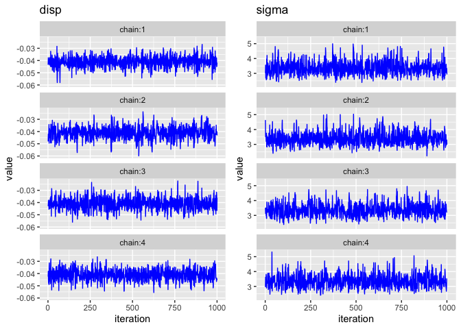
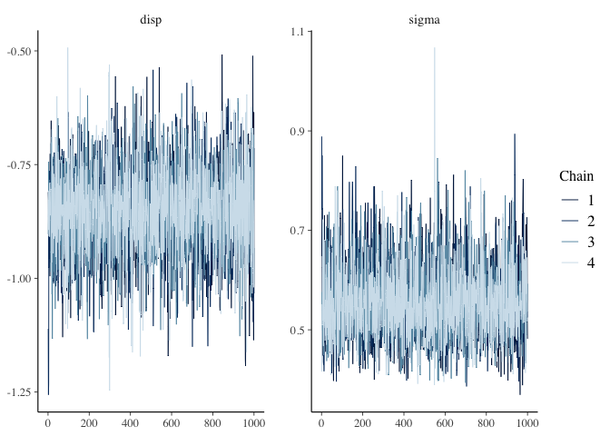
Trace Plots
The bayesplot package provides the function mcmc_trace which plots the MCMC draws.
mcmc_trace(post, pars=c("disp", "sigma"))
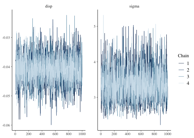 There are three things I am looking for in the trace plot of each chain:
-
Good mixing - In other words, the chain is rapidly changing values across the full region versus getting “stuck” near a particular value and slowly changing.
-
Stationarity - The mean of the chain is relatively stable.
-
Convergence - All of the chains spend most of the time around the same high-probability value.
The trace plots above look good. However, sometimes it can be hard to tell when there are multiple chains overlaid on the same plot, so two alternatives are shown below.
Trace Plots with ggplot2
One alternative is to manually plot each chain separately. Here’s one way to do it with ggplot2.
library(gridExtra)

pars <- c("disp", "sigma")

plts <- list()
for (par in pars)
{
  df <- as.data.frame(post[,,par]) %>%
    mutate(iteration = row_number()) %>%
    pivot_longer(cols=c(-"iteration"), values_to="value", names_to="chain")

  plts[[par]] <- df %>%
    ggplot() +
    geom_line(mapping=aes(x=iteration, y=value), color="blue") +
    facet_wrap(~chain, ncol=1) +
    labs(title=par)
}

grid.arrange(grobs=plts, nrow=1)
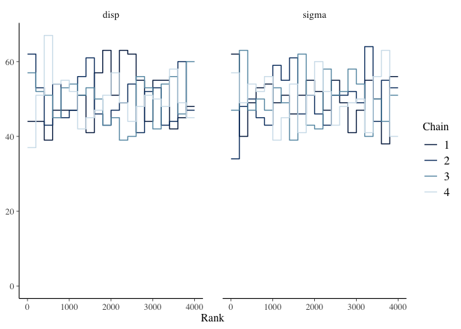
Trace Rank Plot
Another alternative is the mcmc_rank_overlay function. This function plots a trace rank plot which is the distribution of the ranked samples.
mcmc_rank_overlay(mdl1, pars=c("disp", "sigma"))
Effective Sample Size
Since MCMC samples are usually correlated, the effective sample size (n_eff) is often less than the number of samples. There is no hard and fast rule for what is an acceptable number for n_eff. McElreath’s guidance is it depends on what you are trying to estimate. If you are interested mostly in the posterior mean, then n_eff = 200 can be enough. But if you are interested in the tails of the distribution and it’s highly skewed then you’ll need n_eff to be much larger. There are two parameters, iter and warmup, which you can adjust in stan_glm if a larger n_eff is needed.
The summary function displays n_eff (and a lot of other information) for the object returned by stan_glm.
summary(mdl1)
##
## Model Info:
##  function:     stan_glm
##  family:       gaussian [identity]
##  formula:      mpg ~ disp
##  algorithm:    sampling
##  sample:       4000 (posterior sample size)
##  priors:       see help('prior_summary')
##  observations: 32
##  predictors:   2
##
## Estimates:
##               mean   sd   10%   50%   90%
## (Intercept) 29.6    1.3 27.9  29.6  31.2
## disp         0.0    0.0  0.0   0.0   0.0
## sigma        3.4    0.5  2.8   3.3   4.0
##
## Fit Diagnostics:
##            mean   sd   10%   50%   90%
## mean_PPD 20.1    0.9 19.0  20.1  21.2
##
## The mean_ppd is the sample average posterior predictive distribution of the outcome variable (for details see help('summary.stanreg')).
##
## MCMC diagnostics
##               mcse Rhat n_eff
## (Intercept)   0.0  1.0  3501
## disp          0.0  1.0  3328
## sigma         0.0  1.0  3056
## mean_PPD      0.0  1.0  3411
## log-posterior 0.0  1.0  1529
##
## For each parameter, mcse is Monte Carlo standard error, n_eff is a crude measure of effective sample size, and Rhat is the potential scale reduction factor on split chains (at convergence Rhat=1).
Posterior Distribution
Since the chains and n_eff look good, I’ll examine the posterior distribution next. The Bayesian posterior point estimates for a and b are shown below.
coef(mdl1)
## (Intercept)        disp
##    29.57206    -0.04103
The 89% credible intervals for all a, b and sigma are shown below. Why 89%? Why not? (See p56 of Statistical Rethinking for thoughts on this.)
knitr::kable(posterior_interval(mdl1, prob=0.89))
| 5.5% | 94.5% | |
|---|---|---|
| (Intercept) | 27.5281 | 31.6159 |
| disp | -0.0488 | -0.0333 |
| sigma | 2.7365 | 4.1542 |
Posterior Predictive Distribution
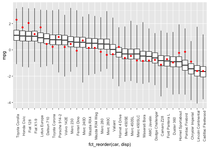
Finally, I’ll check the posterior predictive distribution. The posterior_predict function draws samples from the posterior predictive distribution. I do some manipulation of the dataframe to display boxplots of the posterior draws (car type ordered by increasing disp) and then overlay the observed mpg in red.
library(forcats)

post <- posterior_predict(mdl1) %>%
  apply(2, fivenum) %>%
  t() %>%
  as.data.frame() %>%
  rownames_to_column(var="car")

dat <- mtcars %>%
  select(c("mpg", "disp")) %>%
  rownames_to_column(var="car")

plyr::join(dat, post, by="car") %>%
  ggplot(aes(x=fct_reorder(car, disp))) +
  geom_boxplot(mapping=aes(ymin=V1, lower=V2, middle=V3, upper=V4, ymax=V5),
               stat="identity",
               outlier.shape = NA) +
  geom_point(mapping=aes(y=mpg), color="red") +
  theme(axis.text.x = element_text(angle = 90))
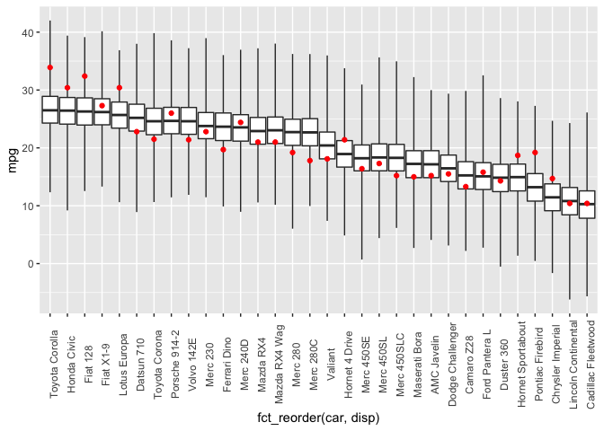
Unsurprisingly, this model doesn’t predict the observed data all that well.
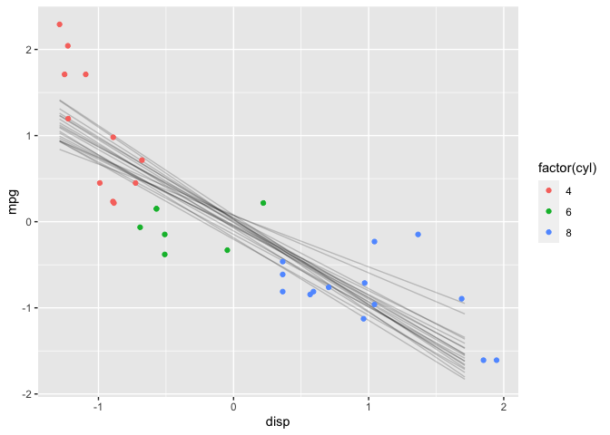
Another useful visualization is the expectation of the posterior predictive distribution (i.e., (\mu)). The posterior_linpred function returns the linear predictor, possibly transformed by the inverse-link function. The posterior_epred function returns the expectation over the posterior predictive distribution. In this case, the model is a Gaussian likelihood with an identity link function, so the two functions return identical results.
newdata <- data.frame(disp=seq(min(mtcars$disp), max(mtcars$disp)))

y_rep <- as.data.frame(t(posterior_linpred(mdl1, newdata=newdata, draws=50))) %>%
  cbind(newdata) %>%
  pivot_longer(cols=starts_with("V"), names_to="grp", values_to="mpg")

y_rep %>%
  ggplot(aes(x=disp, y=mpg)) +
  geom_line(aes(group=grp), alpha=0.2) +
  geom_point(data = mtcars, aes(color=factor(cyl)))
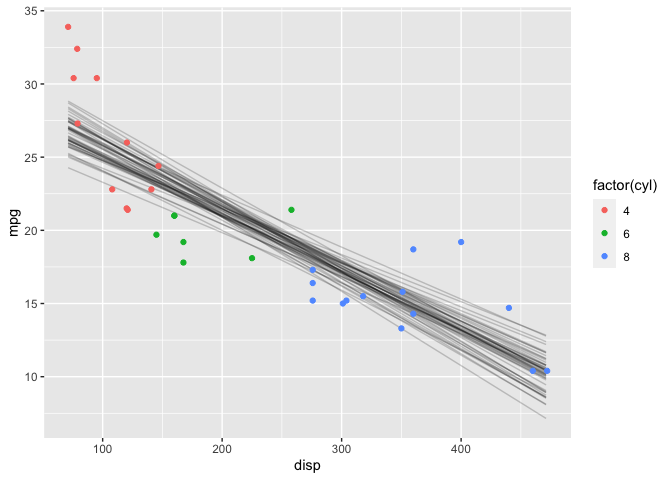
Note that this plot looks very similar to a frequentist confidence interval.
Linear Model with User-Specified Priors
This time I’ll specify priors instead of using the defaults. First, I’ll standardize both mpg and disp since that will make it a bit easier to choose the priors. This time I’ll choose a prior for the slope that is centered at -1 rather than at 0; you’ll see the effect in the prior predictive distribution.
# Standardize
df <- data.frame(mtcars %>% select(mpg, disp) %>% scale())
df['cyl'] = mtcars$cyl

mdl2 <- stan_glm(mpg ~ disp, data = df,
                 prior = normal(-1,1/sqrt(2)), # prior for slope
                 prior_intercept = normal(0,1/sqrt(2)), # prior for intercept
                 cores=2)
Prior Predictive Distribution
# Alternative method for plotting prior predictive distribution
mdl2_prior_pred <- stan_glm(mpg ~ disp, data = df,
                 prior = normal(-1,1/sqrt(2)), # prior for slope
                 prior_intercept = normal(0,1/sqrt(2)), # prior for intercept
                 prior_PD = TRUE,
                 cores=2)

N <- 100

D <- seq(min(df$disp), max(df$disp), length.out = N)

prior_pred <- data.frame(t(posterior_epred(mdl2_prior_pred,
                                newdata=data.frame(disp=D),
                                draws=N)))

tmp <- prior_pred %>%
  mutate(disp = D)%>%
  pivot_longer(cols=-"disp", names_to="iter", values_to="mpg")

tmp %>%
  ggplot() +
  geom_line(mapping=aes(x=disp, y=mpg, group=iter), alpha=0.2) +
  geom_point(data=df, mapping=aes(x=disp, y=mpg, color=factor(cyl)))
Again, I’ll do a sanity check with the prior predictive distribution.
prior_summary(mdl2)
## Priors for model 'mdl2'
## ------
## Intercept (after predictors centered)
##  ~ normal(location = 0, scale = 0.71)
##
## Coefficients
##  ~ normal(location = -1, scale = 0.71)
##
## Auxiliary (sigma)
##  ~ exponential(rate = 1)
## ------
## See help('prior_summary.stanreg') for more details
Remember, I standardized mpg & disp so that’s why the scales are different in this plot. Notice now that most of the time mpg decreases as disp increases; this is because the prior I chose for b is no longer symmetric about 0. I’m using previous knowledge to make the prior more informative. Ideally, I might want to choose a prior that further constrains (b <= 0) (e.g., Uniform(-1,0) or -Exponential(5)). However, this is one of the limitation of rstanarm–only certain distributions are supported for user-specified priors. The rethinking and rstan packages have greater flexibility in that regard as I’ll demonstrate in another post.
Diagnostic Plots
post <- as.array(mdl2)
mcmc_trace(post, pars=c("disp", "sigma"))
summary(mdl2)
##
## Model Info:
##  function:     stan_glm
##  family:       gaussian [identity]
##  formula:      mpg ~ disp
##  algorithm:    sampling
##  sample:       4000 (posterior sample size)
##  priors:       see help('prior_summary')
##  observations: 32
##  predictors:   2
##
## Estimates:
##               mean   sd   10%   50%   90%
## (Intercept)  0.0    0.1 -0.1   0.0   0.1
## disp        -0.9    0.1 -1.0  -0.9  -0.7
## sigma        0.6    0.1  0.5   0.5   0.7
##
## Fit Diagnostics:
##            mean   sd   10%   50%   90%
## mean_PPD  0.0    0.1 -0.2   0.0   0.2
##
## The mean_ppd is the sample average posterior predictive distribution of the outcome variable (for details see help('summary.stanreg')).
##
## MCMC diagnostics
##               mcse Rhat n_eff
## (Intercept)   0.0  1.0  3812
## disp          0.0  1.0  3454
## sigma         0.0  1.0  3334
## mean_PPD      0.0  1.0  4000
## log-posterior 0.0  1.0  1674
##
## For each parameter, mcse is Monte Carlo standard error, n_eff is a crude measure of effective sample size, and Rhat is the potential scale reduction factor on split chains (at convergence Rhat=1).
The chains and n_eff all look good.
Posterior Distribution
The posterior estimates:
coef(mdl2)
## (Intercept)        disp
##      0.0022     -0.8527
And the 89% posterior credible intervals:
posterior_interval(mdl2, prob=0.89)
##                5.5%   94.5%
## (Intercept) -0.1493  0.1552
## disp        -1.0121 -0.6970
## sigma        0.4528  0.6879
Remember the above are standardized, so I’ll convert back to the orginal scale and compare to the results using the defaults priors.
a_prime <- mu['mpg'] + sigma['mpg']*coef(mdl2)[1] - coef(mdl2)[2] * sigma['mpg'] * mu['disp'] / sigma['disp']
b_prime <- coef(mdl2)[2]*sigma['mpg'] / sigma['disp']

knitr::kable(cbind(coef(mdl1), c(a_prime, b_prime)),
             col.names = c("Default", "User-Specified"))
| Default | User-Specified | |
|---|---|---|
| (Intercept) | 29.572 | 29.6710 |
| disp | -0.041 | -0.0415 |
The results are very similar; turns out there is enough data that the different priors really don’t make much difference.
Posterior Predictive Distribution
Finally, let’s check the posterior predictive distribution:
library(forcats)

post <- posterior_predict(mdl2) %>%
  apply(2, fivenum) %>%
  t() %>%
  as.data.frame() %>%
  rownames_to_column(var="car")

dat <- df %>%
  rownames_to_column(var="car")

plyr::join(dat, post, by="car") %>%
  ggplot(aes(x=fct_reorder(car, disp))) +
  geom_boxplot(mapping=aes(ymin=V1, lower=V2, middle=V3, upper=V4, ymax=V5),
               stat="identity",
               outlier.shape = NA) +
  geom_point(mapping=aes(y=mpg), color="red") +
  theme(axis.text.x = element_text(angle = 90))
And the expectation over the posterior predictive distribution:
newdata <- data.frame(disp=seq(min(df$disp), max(df$disp)))

y_rep <- as.data.frame(t(posterior_linpred(mdl2, newdata=newdata, draws=20))) %>%
  cbind(newdata) %>%
  pivot_longer(cols=starts_with("V"), names_to="grp", values_to="mpg")

y_rep %>%
  ggplot(aes(x=disp, y=mpg)) +
  geom_line(aes(group=grp), alpha=0.2) +
  geom_point(data = df, aes(color=factor(cyl)))
The results are very similar to those with the default priors.
Generalized Additive Model
The linear model is a poor choice for this data, so I’ll try a model with splines next. The stan_gamm4 function from the rstanarm package fits Bayesian nonlinear (and mixed) models. Again, the syntax is very similar to gamm4.
mdl3 <- stan_gamm4(mpg ~ s(disp, bs="cr", k=7),
                   data = mtcars,
                   cores=2,
                   adapt_delta = 0.99)
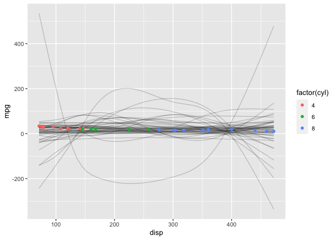
Prior Predictive Distribution
Unlike the linear model, it’s not as straightforward to manually construct the prior predictive distribution. Fortunately, rstanarm will automatically generate it for us–we refit the model without conditioning on the data by setting prior_PD = TRUE.
mdl3_prior_pred <- stan_gamm4(mpg ~ s(disp, bs="cr", k=7),
                   data = mtcars,
                   cores=2,
                   prior_PD = TRUE,
                   adapt_delta = 0.99)
N <- 50

D <- seq(min(mtcars$disp), max(mtcars$disp), length.out = N)

prior_pred <- data.frame(t(posterior_epred(mdl3_prior_pred,
                                newdata=data.frame(disp=D),
                                draws=N)))

tmp <- prior_pred %>%
  mutate(disp = D)%>%
  pivot_longer(cols=-"disp", names_to="iter", values_to="mpg")

tmp %>%
  ggplot() +
  geom_line(mapping=aes(x=disp, y=mpg, group=iter), alpha=0.2) +
  geom_point(data=mtcars, mapping=aes(x=disp, y=mpg, color=factor(cyl)))
Diagnostic Plots
post <- as.array(mdl3)
mcmc_trace(post, regex_pars=c("disp", "sigma"))
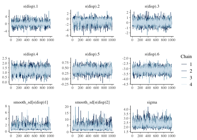
summary(mdl3)
##
## Model Info:
##  function:     stan_gamm4
##  family:       gaussian [identity]
##  formula:      mpg ~ s(disp, bs = "cr", k = 7)
##  algorithm:    sampling
##  sample:       4000 (posterior sample size)
##  priors:       see help('prior_summary')
##  observations: 32
##
## Estimates:
##                       mean   sd   10%   50%   90%
## (Intercept)         20.1    0.4 19.5  20.1  20.6
## s(disp).1            0.1    1.2 -1.3   0.1   1.6
## s(disp).2           -0.9    1.1 -2.4  -0.8   0.2
## s(disp).3            0.0    0.6 -0.7   0.0   0.7
## s(disp).4            1.2    0.4  0.7   1.2   1.6
## s(disp).5            0.4    0.1  0.2   0.4   0.6
## s(disp).6           -3.1    0.3 -3.5  -3.2  -2.8
## sigma                2.4    0.3  2.0   2.4   2.9
## smooth_sd[s(disp)1]  1.2    0.7  0.6   1.1   2.0
## smooth_sd[s(disp)2]  3.6    2.0  1.7   3.1   6.1
##
## Fit Diagnostics:
##            mean   sd   10%   50%   90%
## mean_PPD 20.1    0.6 19.3  20.1  20.8
##
## The mean_ppd is the sample average posterior predictive distribution of the outcome variable (for details see help('summary.stanreg')).
##
## MCMC diagnostics
##                     mcse Rhat n_eff
## (Intercept)         0.0  1.0  2737
## s(disp).1           0.0  1.0  3399
## s(disp).2           0.0  1.0  2010
## s(disp).3           0.0  1.0  3385
## s(disp).4           0.0  1.0  2463
## s(disp).5           0.0  1.0  4204
## s(disp).6           0.0  1.0  3887
## sigma               0.0  1.0  1967
## smooth_sd[s(disp)1] 0.0  1.0  1257
## smooth_sd[s(disp)2] 0.0  1.0  2015
## mean_PPD            0.0  1.0  3147
## log-posterior       0.1  1.0   900
##
## For each parameter, mcse is Monte Carlo standard error, n_eff is a crude measure of effective sample size, and Rhat is the potential scale reduction factor on split chains (at convergence Rhat=1).
The chains and n_eff look good.
Posterior Predictive Distribution
And finally, the posterior predictive distribution:
library(forcats)

post <- posterior_predict(mdl3) %>%
  apply(2, fivenum) %>%
  t() %>%
  as.data.frame() %>%
  rownames_to_column(var="car")

dat <- mtcars %>%
  select(c("mpg", "disp")) %>%
  rownames_to_column(var="car")

plyr::join(dat, post, by="car") %>%
  ggplot(aes(x=fct_reorder(car, disp))) +
  geom_boxplot(mapping=aes(ymin=V1, lower=V2, middle=V3, upper=V4, ymax=V5),
               stat="identity",
               outlier.shape = NA) +
  geom_point(mapping=aes(y=mpg), color="red") +
  theme(axis.text.x = element_text(angle = 90))
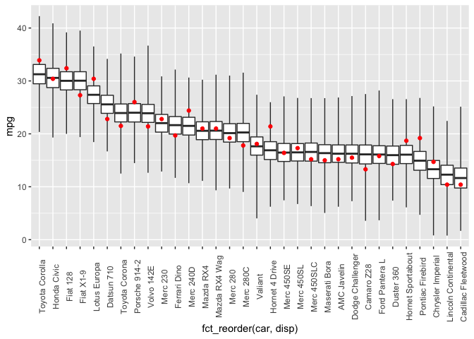
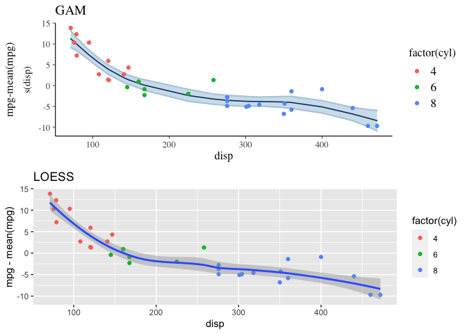
And the expectation over the ppd is plotted below, along with a loess curve for comparison. This model is clearly a better fit to the data than the linear model.
p1 <- plot_nonlinear(mdl3, prob=0.89) +
  geom_point(mapping=aes(x=disp, y=mpg-mean(mpg), color=factor(cyl)),
             data=mtcars) +
  labs(title="GAM", x="disp", y="mpg-mean(mpg)")

p2 <- ggplot(mapping=aes(x=disp, y=mpg-mean(mpg)),
              data=mtcars) +
  geom_point(aes(color=factor(cyl)))+
  stat_smooth(method="loess",
              level=0.89) +
  labs(title="LOESS")

grid.arrange(p1, p2)